the story
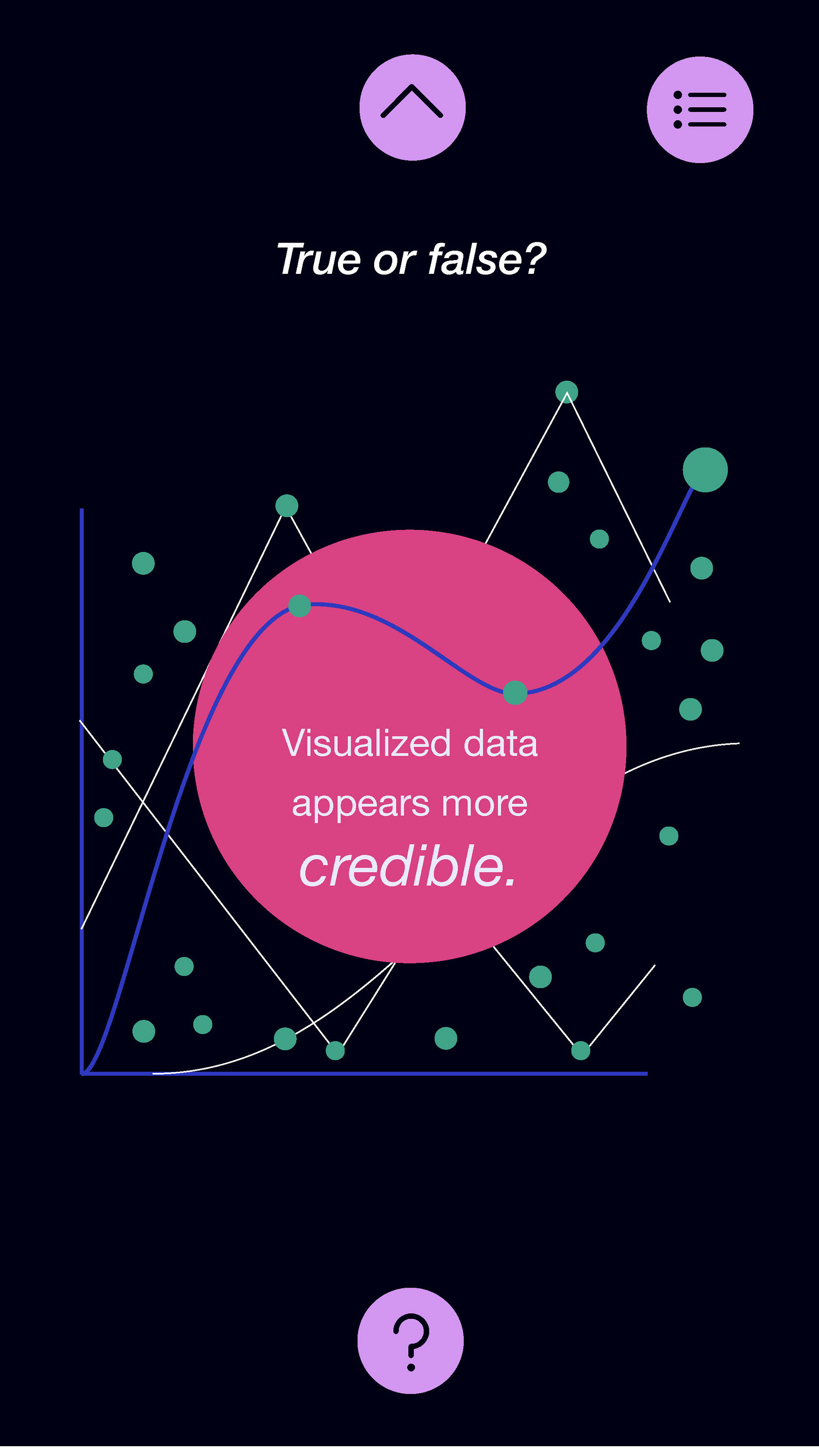
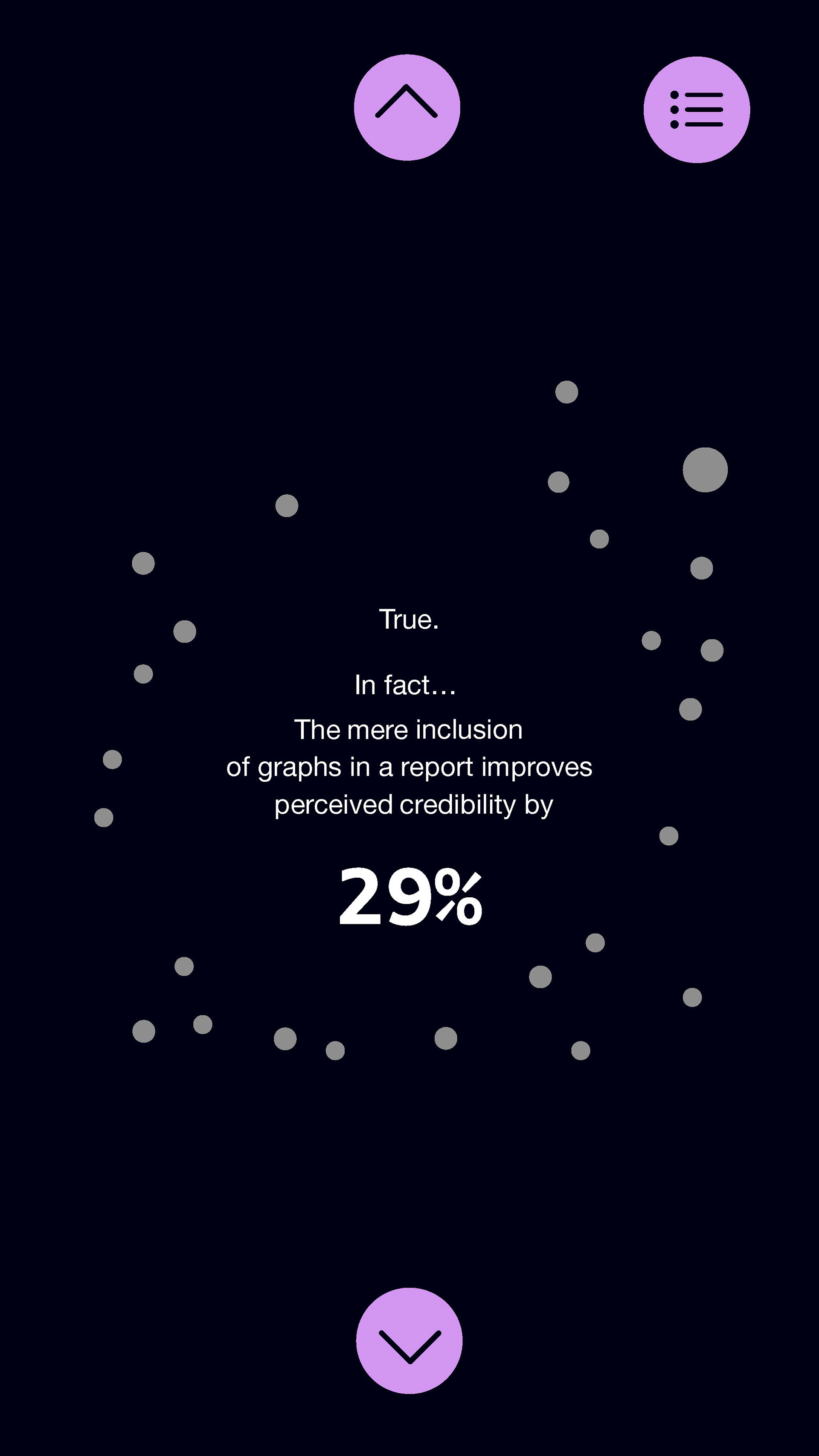
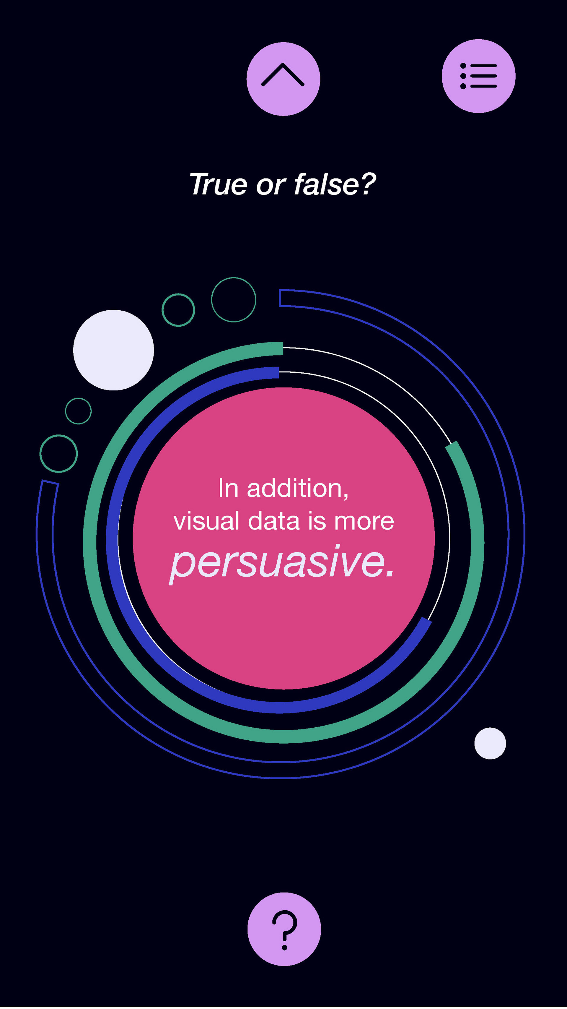
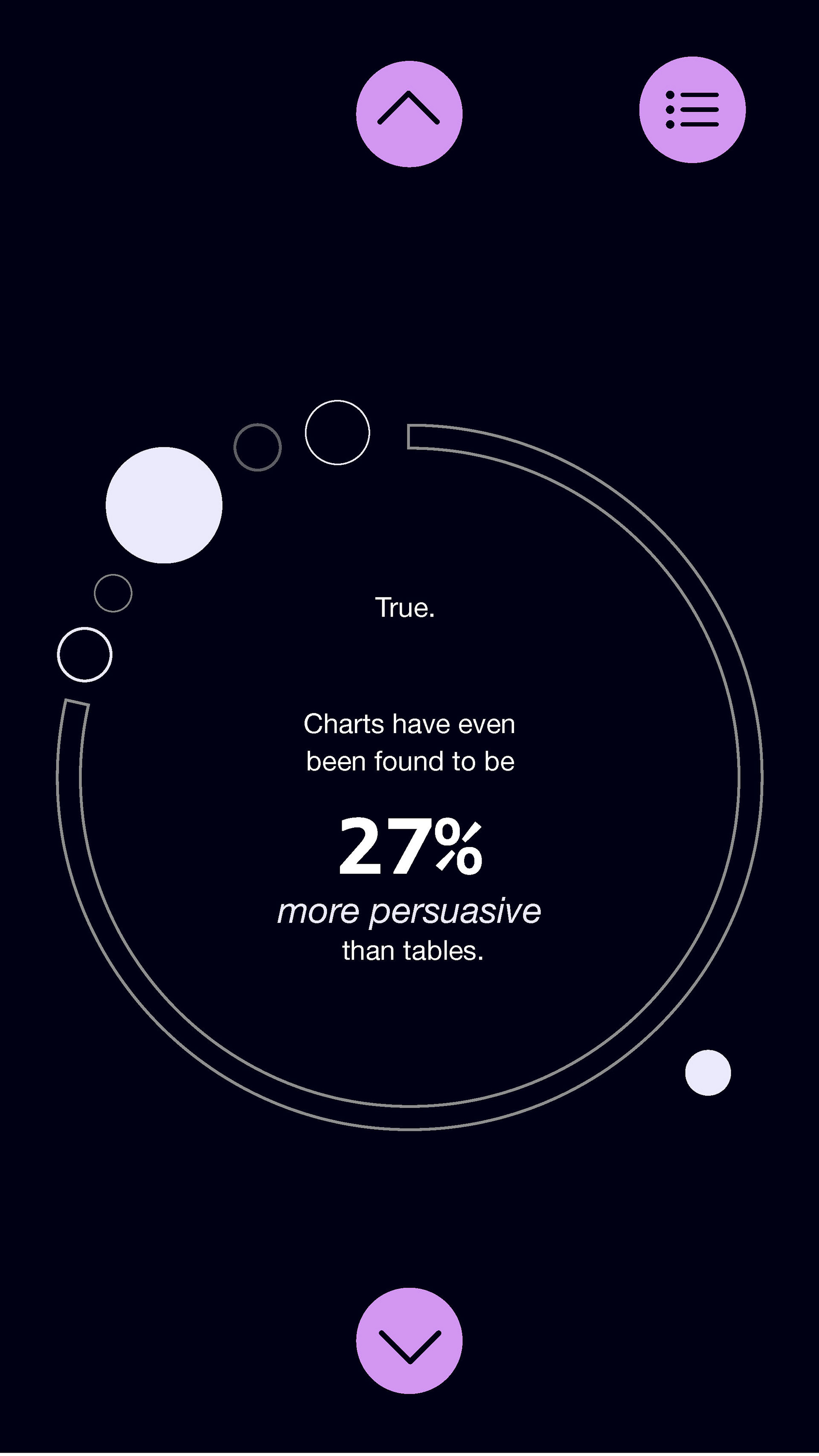
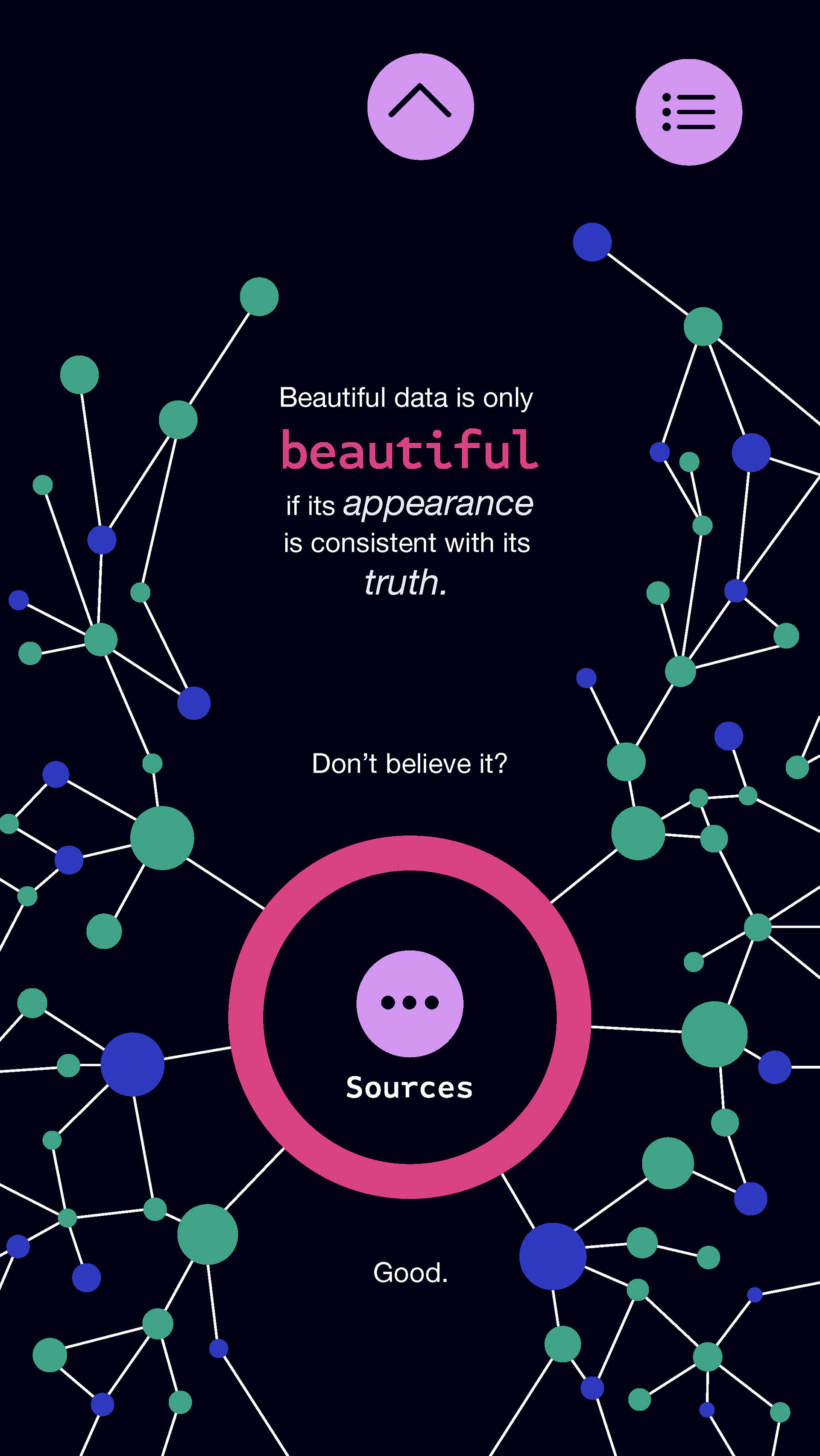
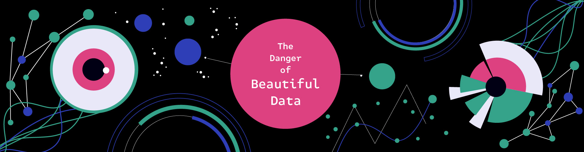
The Danger of Beautiful Data is a hi-fi mockup of an infographic app about the manipulative & persuasive potential of infographics. By picking this topic as a joke, I tricked myself into learning a lot about how the brain processes images.
I looked for statistics and information on persuasive presentations of data, and how aesthetics affect the perceived credibility of content. It was validating (and scary) to have a difficult time finding this information. Most of the sources I found in my first round of googling referenced faulty or completely fabricated data! However, I was able to find enough primary sources to write a short script.
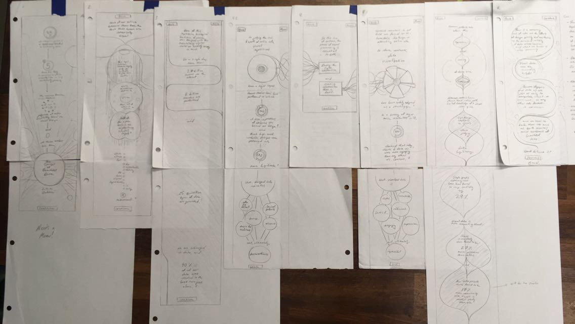
That short script turned into some long sketches:
...and then into artboards...
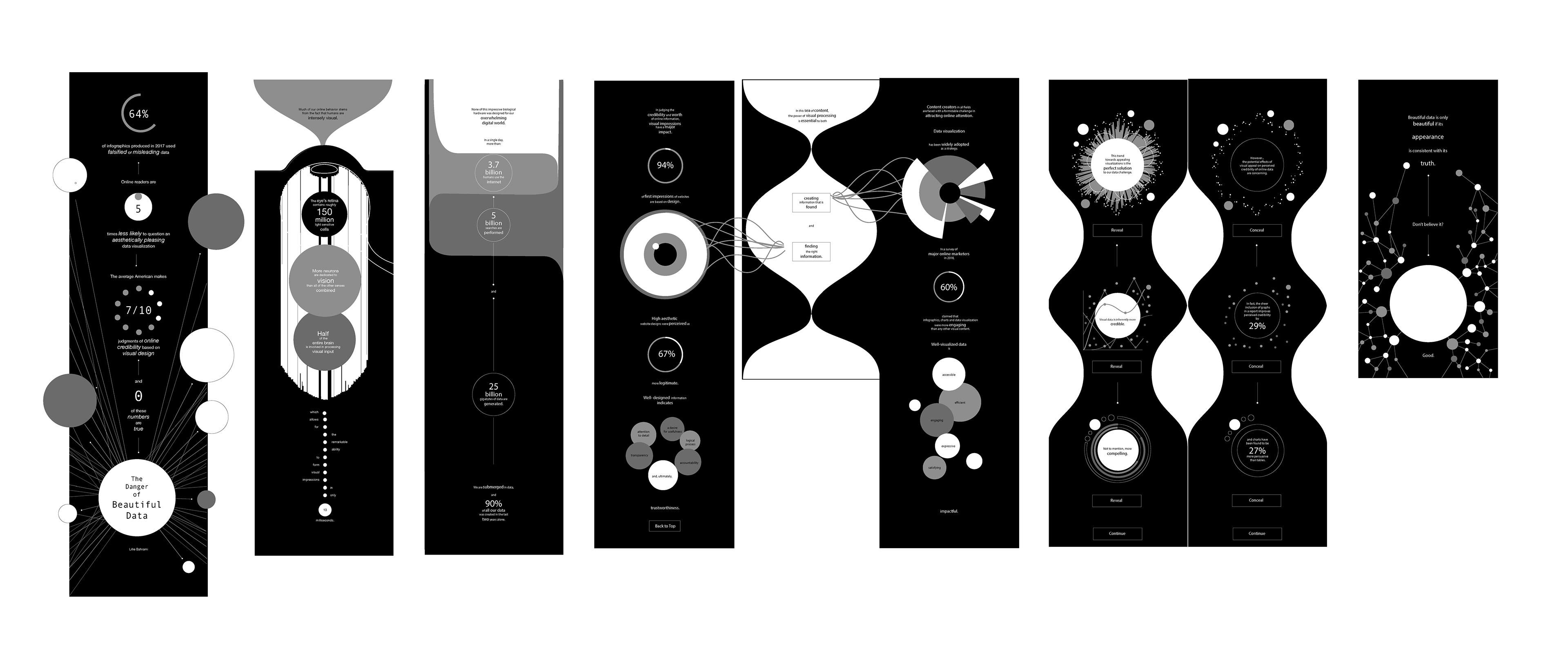
...and, finally, into an Adobe XD prototype.
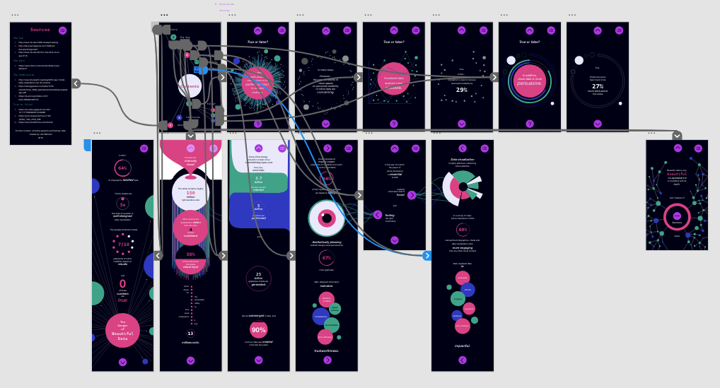
gallery // click for full images