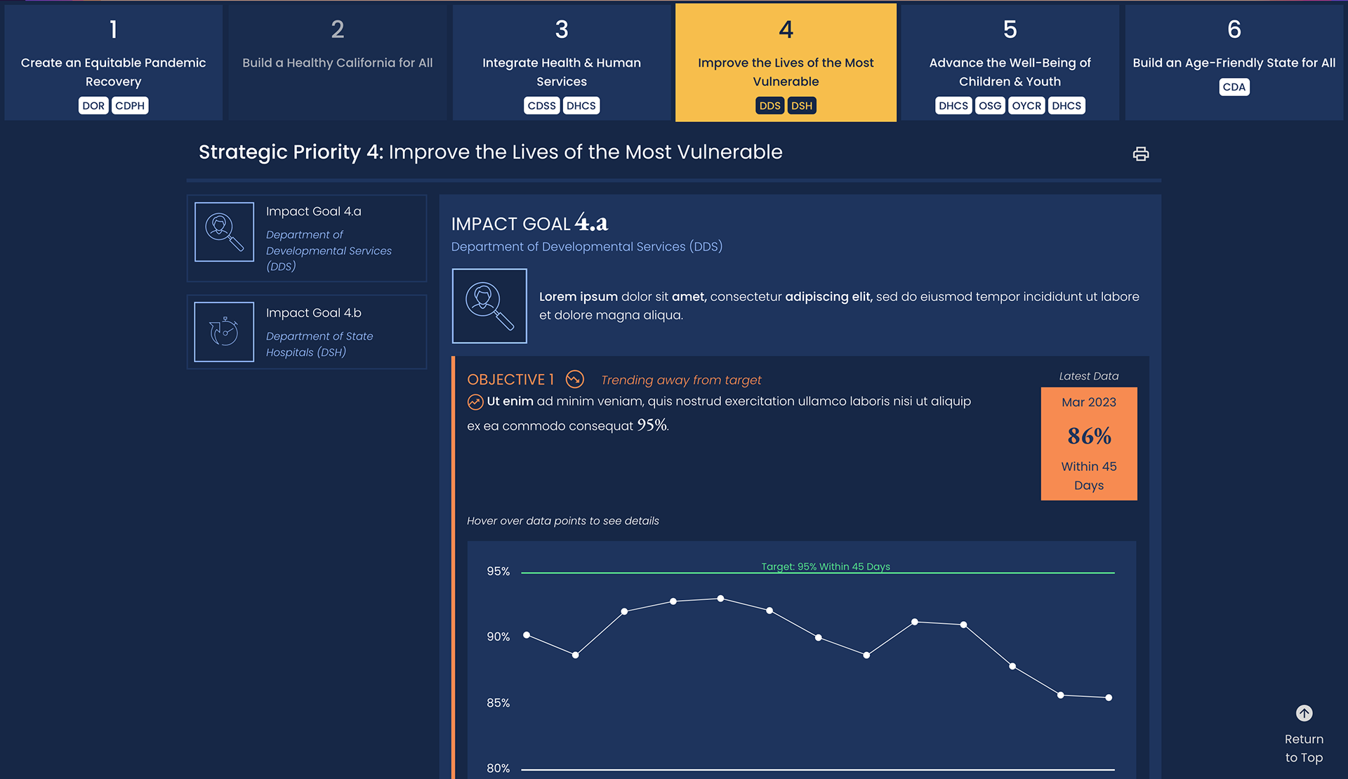
Main view of Data Visualization Dashboard. "Strategic Priority" 4 is selected. Sensitive text has been replaced with lorem ipsum.
This project tracked the progress of several internal DEI metrics for a state health department. Although it was a deliberate process to design the app to their standards, it was a blast to code-- Highcharts and Svelte provided a fast and seamless dev experience.
One of the main stakeholders on the customer's team was completely visually impaired, and I'll never forget what it was like to lead a usability test with her on a prototype of the app. I became very, very aware of why not to treat screenreader users as a monolith-- each individual has browsing preferences, and following my own checklists of best a11y practices may still sometimes leave users in the dark. There's no substitute for testing with real people!
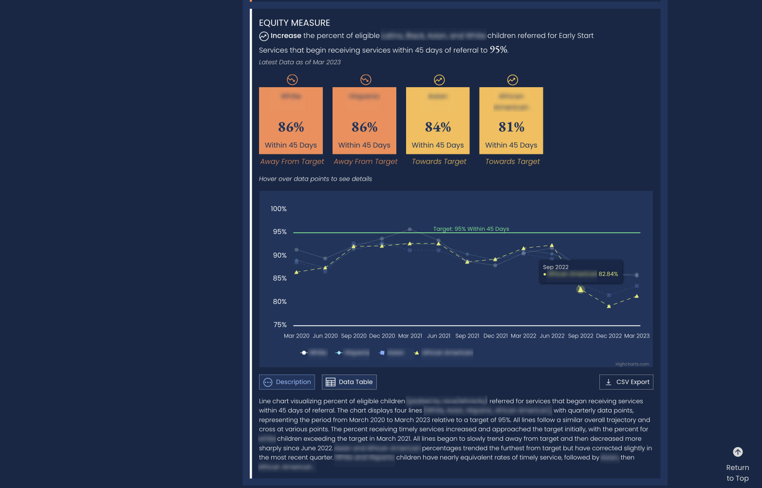
Complex metric on the Data Visualization Dashboard, highlighting multiple variables on one chart and our longform description of the chart to describe the shape of the data for screenreader users. Sensitive text has been blurred.