design fuel
Colorado has multiple sets of peaks over 13,000' and 14,000': our thirteeners and fourteeners. Within those sets, we also have ranked and unranked peaks, which are determined by a statistic called prominence (i.e., rise and fall relative to the peak's nearest neighbor.) There's a thriving subculture of mountaineers, peakbaggers, who strive to hike to the summit of each ranked peak on those lists.
In 2020, The National Map gathered LiDAR data on Colorado's topography. Because LiDAR is far more precise than the methods previously used, the height of every point in the state changed quite a bit. As the peakbagging community processed the new data, they discovered that many mountains' categories had changed, disrupting quite a few summit checklists.
my part of the story
Despite the inherently spatial nature of these changes, I'd never seen them mapped out or even visualized. I set out to not only boil this complex information down into an effective symbology, but also to learn how to make gorgeous static maps in Esri's flagship software, ArcGIS Pro.
I started by grabbing the peak data from Lists of John, narrowing it down in Excel to the sets of peaks I was interested in, categorizing each peak, and importing it as a new feature class.
From there, I stitched together a DEM of Colorado from USGS rasters, generated a multidirectional hillshade on top... and iterated on the graphic design for two whole months. This was truly a test of my data visualization skills, and the maps that came out the other side are definitely worth the blood, sweat & tears... just like a summit attempt.
final images // click to enlarge
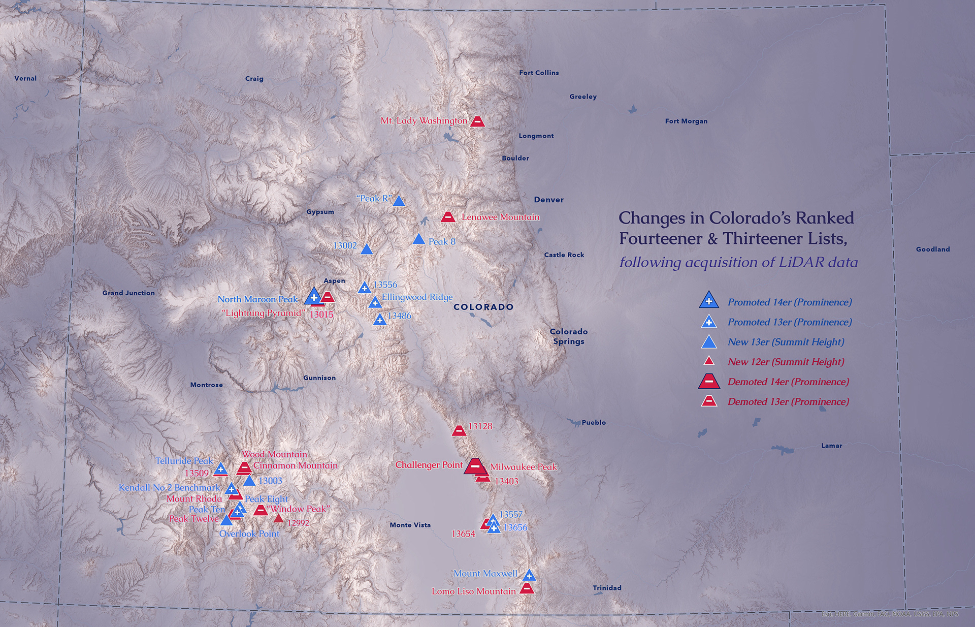
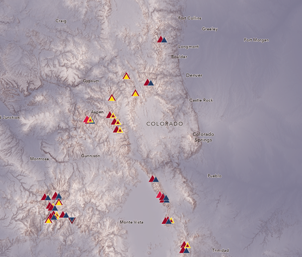
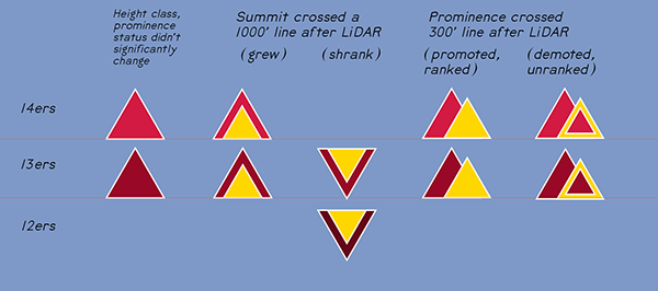
Changes in Colorado's Ranked Fourteener and Thirteener Lists, following acquisition of LiDAR data. The image shows a map of the state of Colorado with mountains highlighted that were either promoted or demoted due to the more accurate data.
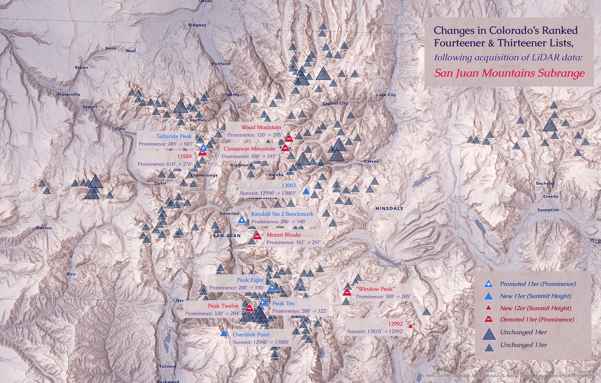
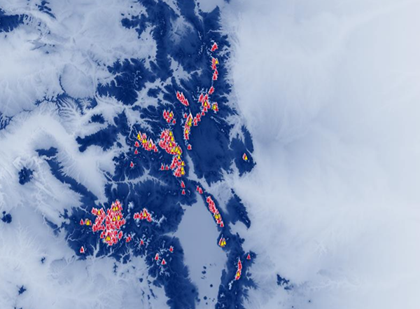
The image shows a map of the San Juan Mountains Subrange, with mountains highlighted that were either promoted or demoted due to the more accurate data.
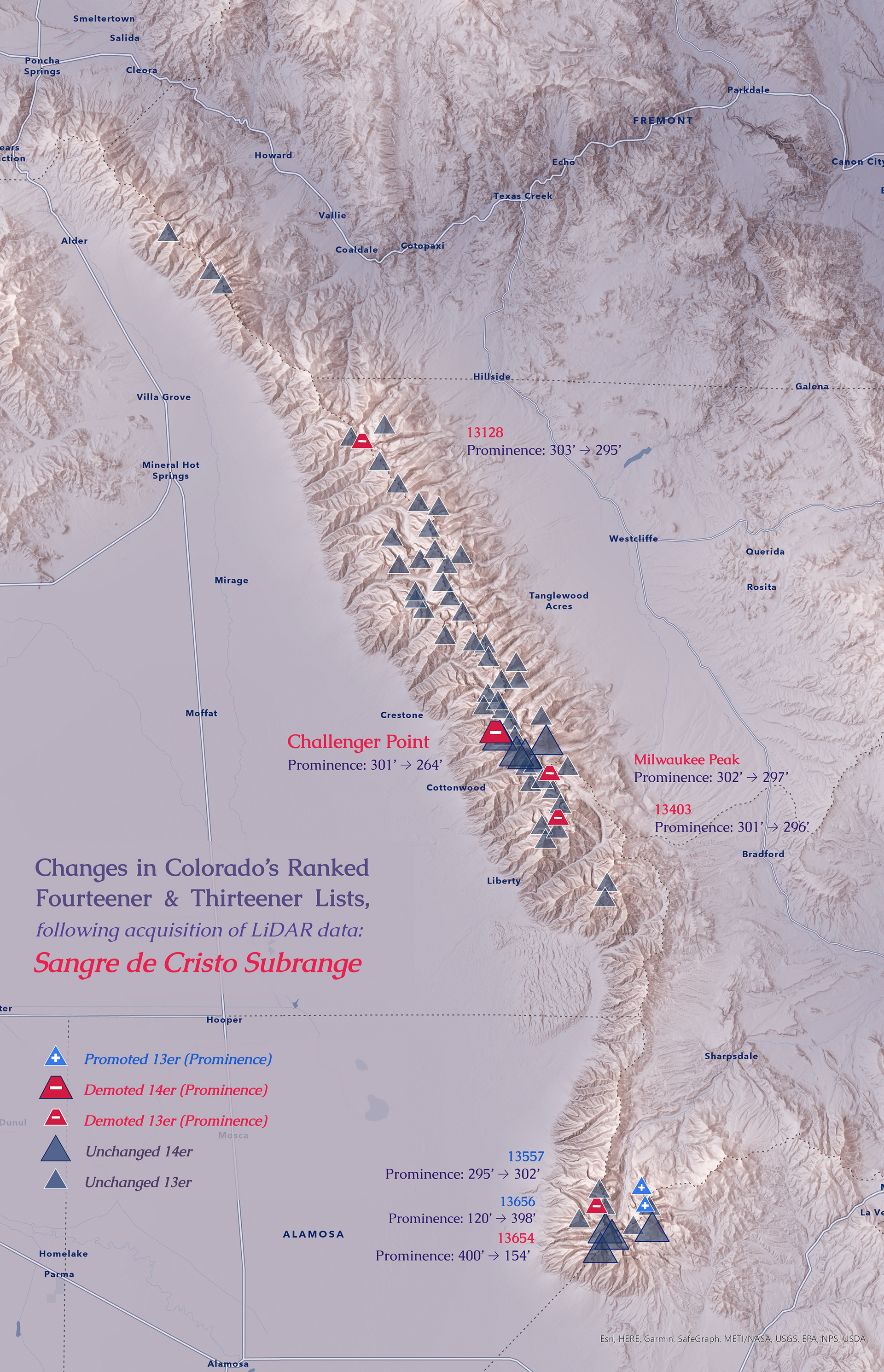
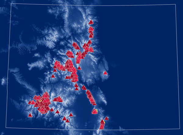
The image shows a map of the Sangre de Cristo Mountains, with mountains highlighted that were either promoted or demoted due to the more accurate data.
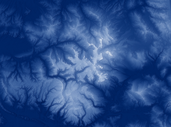
symbology and basemap drafts